Experiments with drought index-based insurance
For work at Earth Lab and for my thesis, I was asked to see what weather-based index insurance would look like with a drought index. So,
using the structure of a USDA rainfall index insurance program called "Pasture, Rangeland, and Forage", I did that using 11 different
drought indices. I will post the thesis and related articles when they are published and they will describe the process and results in
detail, but for now here are some of the graphics that came out of the project along with brief descriptions.
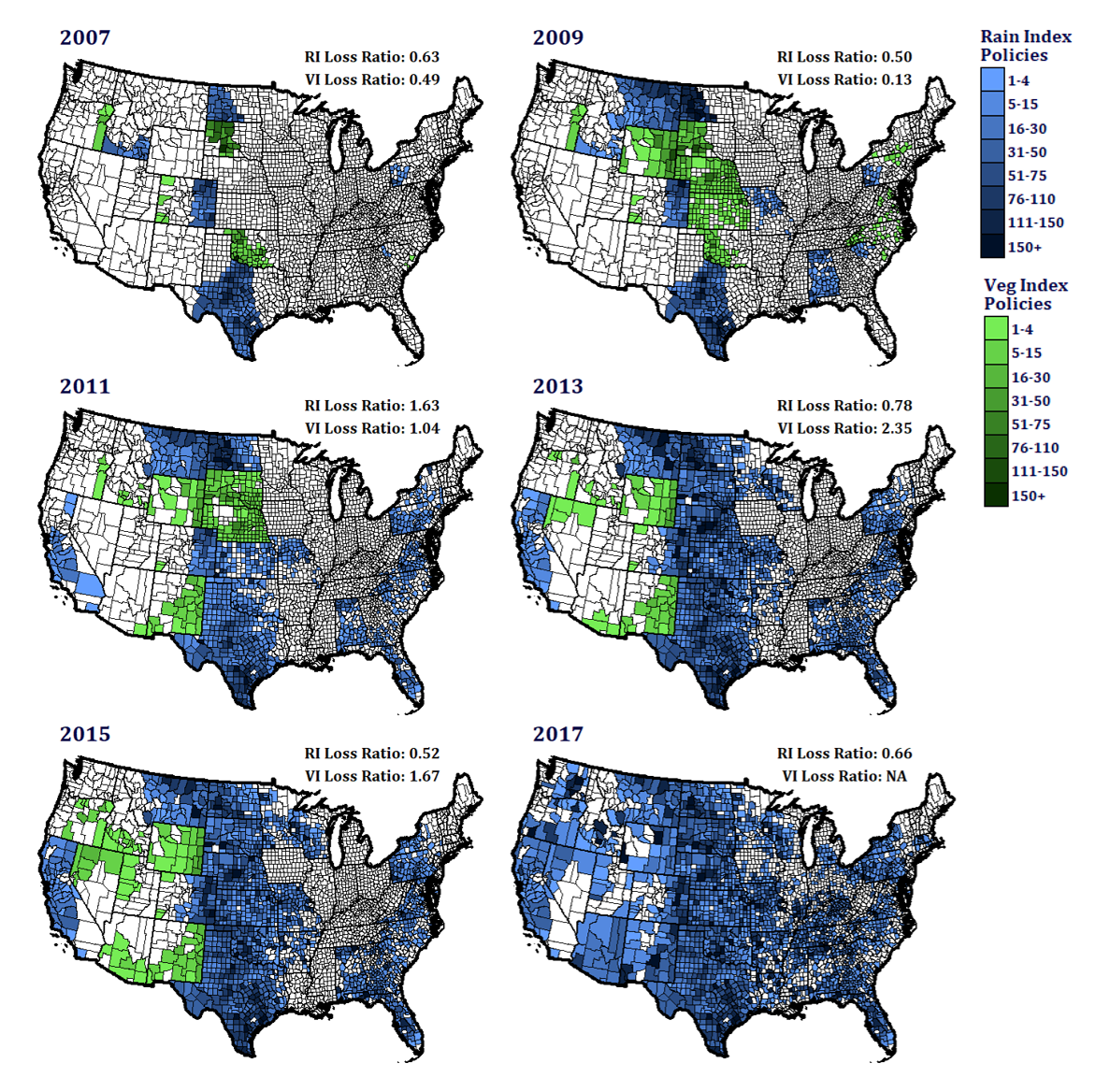
Pasture, Rangeland, and Forage Adoption and Loss Ratios
The program started in 2007 as a pilot, and payments were based on either a rainfall or NDVI-based vegetation index. The
vegetation was dropped in 2015 before the program went national, but I wasn't entirely sure why. So, using Risk Mangement
Agency business reports, I created these maps showing participation and yearly loss ratios for each index. It turns out
that the vegetation index loss ratios vacillated wildy, going as low as 0.04 in 2010 (not displayed) and as high as 2.35 in
2012 and 2013. Maybe there were other reasons they dropped it, but this alone would be cause enough. This map was made entirely
in R with ggplot.
 test link