University of Colorado Boulder Projects
At CU Boulder, I focused on climate risk management, particularly as it concerns drought and the cattle ranching industry in the US. The course work for this program was split between more conceptual geography, statistics, and GIS programming applications. Here, I'll try to select some of the more interesting outcomes and briefly explain them.
Thesis Work: Drought Index-Based Insurance
For my thesis and research assistantship, I was asked to demonstrate what weather-based index insurance would look like with a drought index. This form of insurance is relatively new for agriculture and bases payments only on a measurement of some weather variable. It is popular because it targets one hazard at a time and reduces the ability of policyholders to act in ways that increase their chances of getting paid. The idea here, though, is that the weather measurement matches well with the losses it assumed to indicate. For drought in agriculture, one would think that a drought index would be a popular indicator, though such plans are difficult to find. So, I decided to design my own plan around the structure of an existing rainfall index insurance program called "Pasture, Rangeland, and Forage" (PRF), which is managed by the Risk Management Agency of the USDA. What follows are hypothetical historical outputs from experimental plans designed to fit 11 different drought indices with a variety of characteristics. I will post the thesis and related articles when they are published and they will describe the process in detail, but for now here are some of the graphics that came out of the project.
Drought Index Insurance Analysis Laboratory
This application allows the user to calculate hypothetical payouts using the experiment insurance plans, expressed as potential outputs across the US and over time. There is an in-app description that will give you an idea of how it works. I still have some tinkering to do; I'd like to more precisely scale the actuarial rates and better tailor the experimental program for each location. However, it is still useful to get an idea of the general differences in the patterns of payouts between rainfall and drought index-based plans. One of the most prominent distributional differences is that the drought indices tend to pay more in the spring and summer while the rainfall index tends to pay more in the winter in fall. Because the entire year cannot be covered, the rainfall index often incentivizes protection of non-growing season months while the exact opposite is true for each of the drought indices. Also, drought indices that are calculated over a longer time period (or that include some "drought memory" as is the case with the Palmer indices) exhibit a grouping pattern that would reduce the risk of non-payment during drought and reduce unnecessary payouts during non-drought periods. The application also has some useful features that are part of the software package that it was created with: try pressing control when you click on the map to rotate it and use the sortable table for a broad view of various index features. Data was retrieved from the Risk Management Agency of the USDA, the Climate Prediction Center of NOAA, and the Westwide Drought Tracker via the Desert Research Institute's web-site. This was created using Plotly's new DASH platform and served via NGINX and Green Unicorn on an AWS EC2 Ubuntu instance. The unembedded version, which works better, can be found here.
Pasture, Rangeland, and Forage Adoption and Loss Ratios
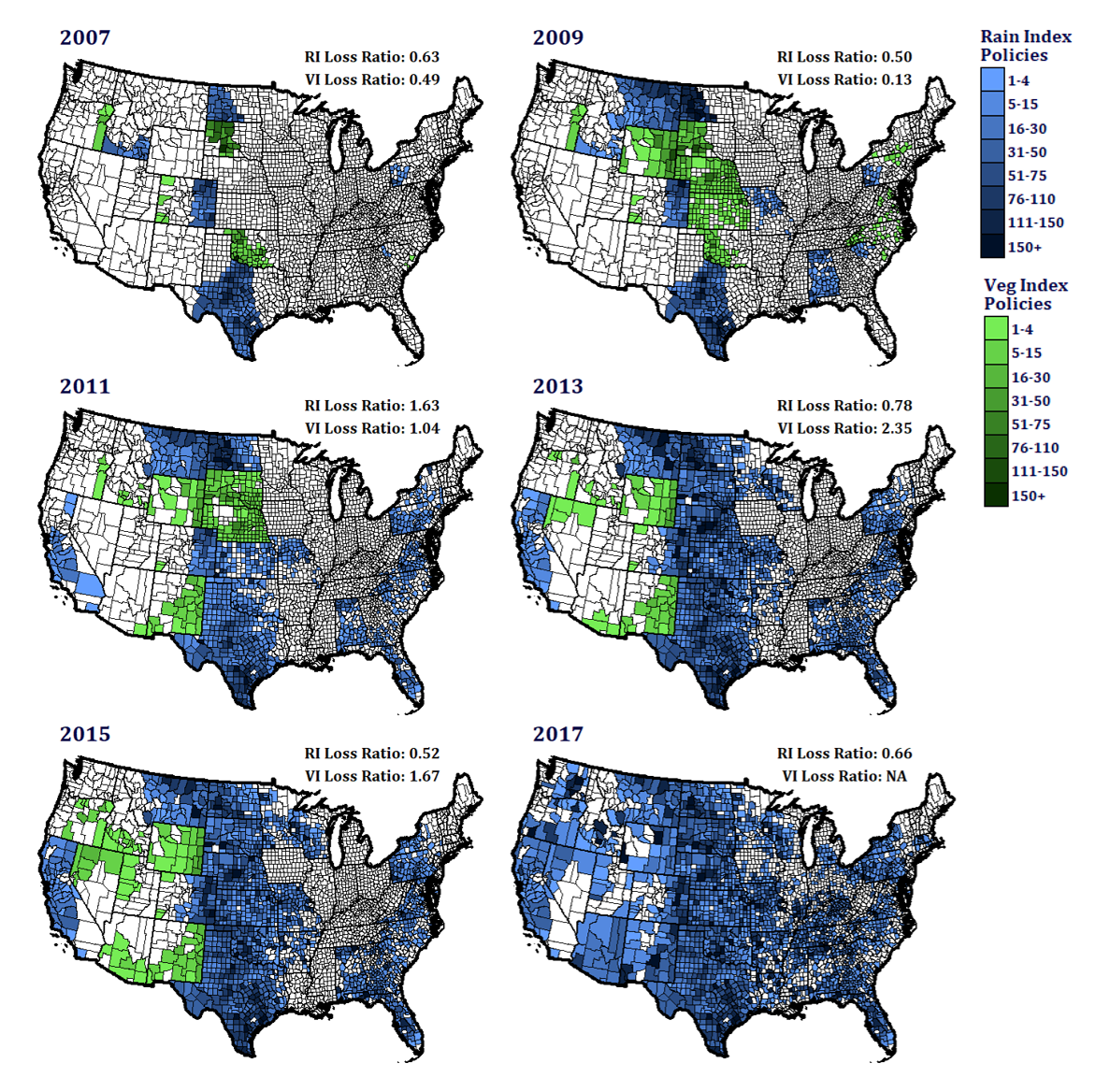
The PRF program started in 2007 as a pilot, and payments were based on either a rainfall or NDVI-based vegetation index. The vegetation index was dropped in 2015 before the program went national, but I wasn't entirely sure why. So, using Risk Mangement Agency business reports, I created these maps showing participation and yearly loss ratios for both indices. It turns out that the vegetation index loss ratios vacillated wildy, going as low as 0.04 in 2010 (not displayed) and as high as 2.35 in 2012 and 2013. Maybe there were other reasons they dropped it, but this might have had something to do with it. These were made entirely in R with ggplot.
Experimental Drought Index Insurance Example
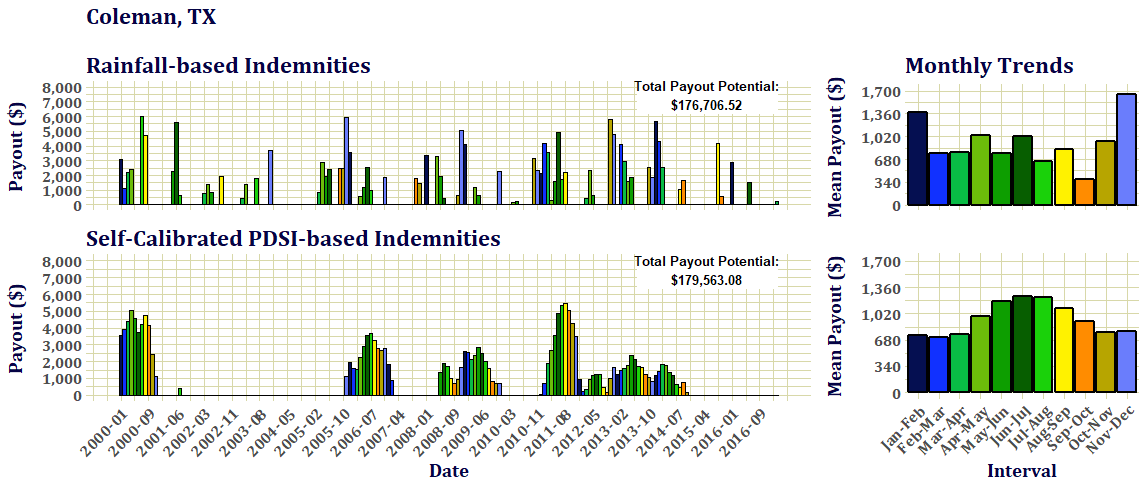
This is an example of payouts from one of the experimental drought index insurance plans: the Self-Calibrating Palmer Drought Severity Index. This graph shows the somewhat random nature of rainfall-based payouts, a grouping pattern of payouts that arise from drought indices with a longer "climate memory", and the seasonality of payouts between each. In this example, the total amount of potential payouts are roughly equal.
Odd Palmer Drought Severity Index Results
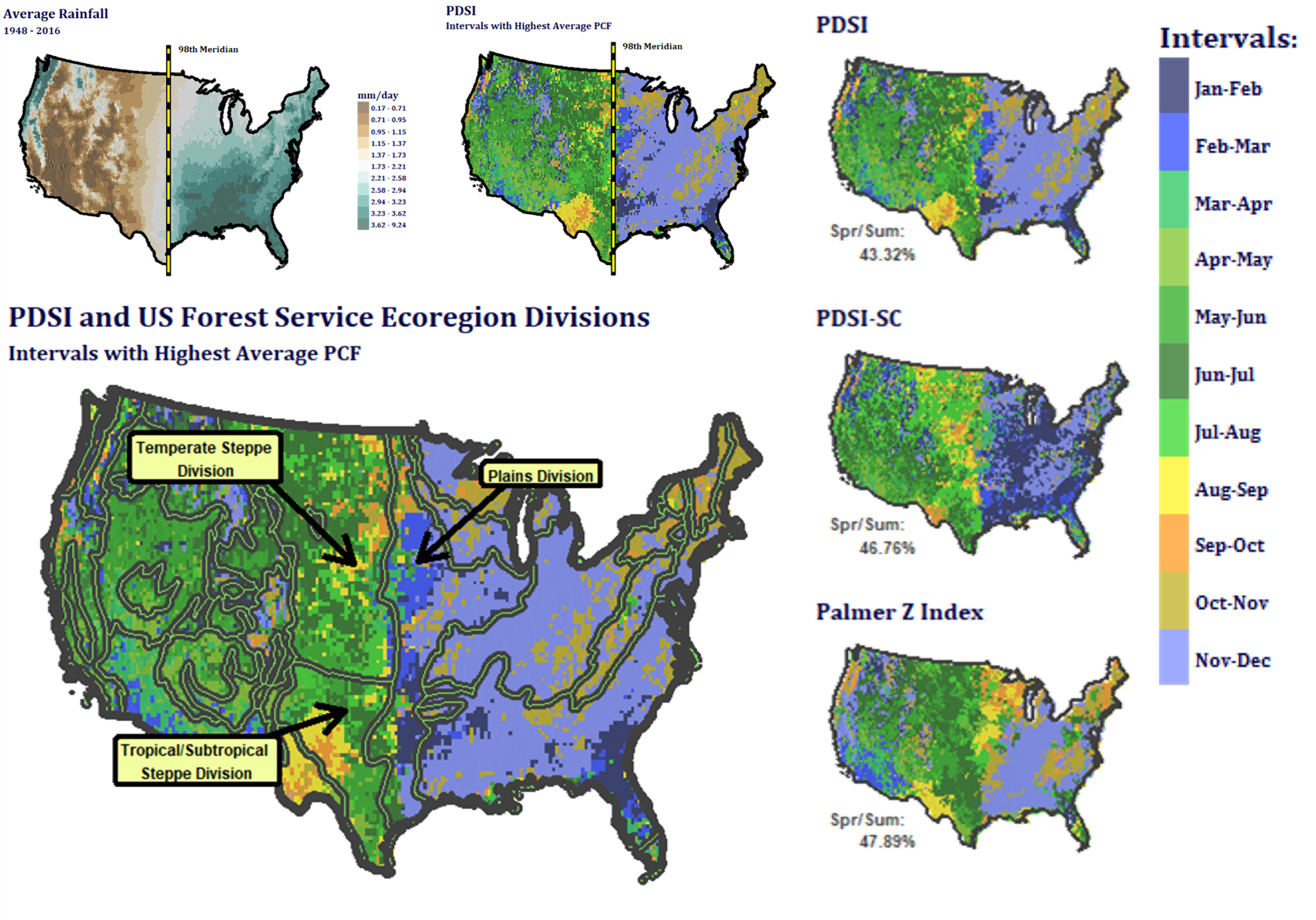
One of the concerns of the rainfall index is that it often pays more in the winter and fall than in the growing season. To see if drought indices might incentivize growing seaosn selection, I mapped the months when each would pay the most according to payment calculation factor (PCF) trends since 1948. The PCF is a relative measure of the amount of money an index would trigger in the structure of the PRF. The Palmer drought severity indices showed strange seasonality, it lines up strikingly well with the 98th meridian and the USFS ecoregions. The data for this map was generated with numpy arrays in Python, and rendered with ggplot in R.
Comparing the Rainfall Insurance to the US Drought Monitor
As a side project, I was asked to calculate the likelihood that the PRF insurance program would not pay when the US Drought Monitor (USDM) says that there's drought. This was tricky because the USDM and the rainfall index (RI) of the PRF are completely different things. The USDM monitor is a weekly categorical product while the RI is bi-monthly product expressed as percentages. So, to do this, I developed a tool that allows the user to select a level of rainfall deficit that would trigger payouts in the PRF and generate a map of the conditional probability of experiencing both a chosen level of drought severity according to the US Drought Monitor (as a modal value over two months) and not receiving a payout. This is done via Plotly's new DASH platform, using mapbox to overlay scatterplots of Numpy arrays on an zoomable map. It is served on an EC2 Ubuntu machine through Amazon Web Services. Data was retrieved from the Climate Prediction Center of NOAA and The National Drought Mitigation Center at the University of Nebraska-Lincoln. More explanation can be found in the application and the unembedded version can be found here.
Thesis Work: Climate Signal in Market Data
Another chapter in my thesis was an econometric analysis of drought impacts in the climate market. It used the same weather indices above to try and quantify the impacts of drought on cattle weights at live-cattle auctions. This was a two-way fixed effects panel model that used two years of seasonal climate values (averaged within a 500km radius around each auction) and average price to predict cattle weights across a 140 site sample in the central US. This is another project that will be explained in more detail when the papers are published, but some of the findings were interesting enough for a glance here.
Market Model Local Residuals
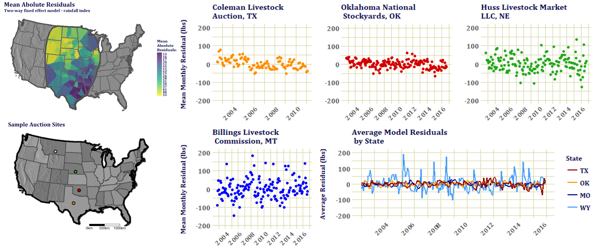
The model was ran for each of the twelve indices (including the rainfall index) and growing season effects were consistently significant. The model explained almost 80% of the total variance in cattle weights. Each index explained surprisingly similar amounts of variance. The model wasn't as strong in the northern auctions where seasonality in market weights made the predictions unstable despite an attempt to correct for that. These are the residual structures from just the rainfall index model. The initial model runs were developed in the "plm" R package, but clustering standard errors using this program proved to be too cumbersome for me, so the the final products were calculated in STATA and exported to R for graphing. Also, this model may not have been based on the most precise specification of the relationship between climate and cattle weight responses, so I developed a tool that allows the user to experiment with the formula and get an immediate summary of the results: www.ranch-market-weather.co
Determining Market Areas
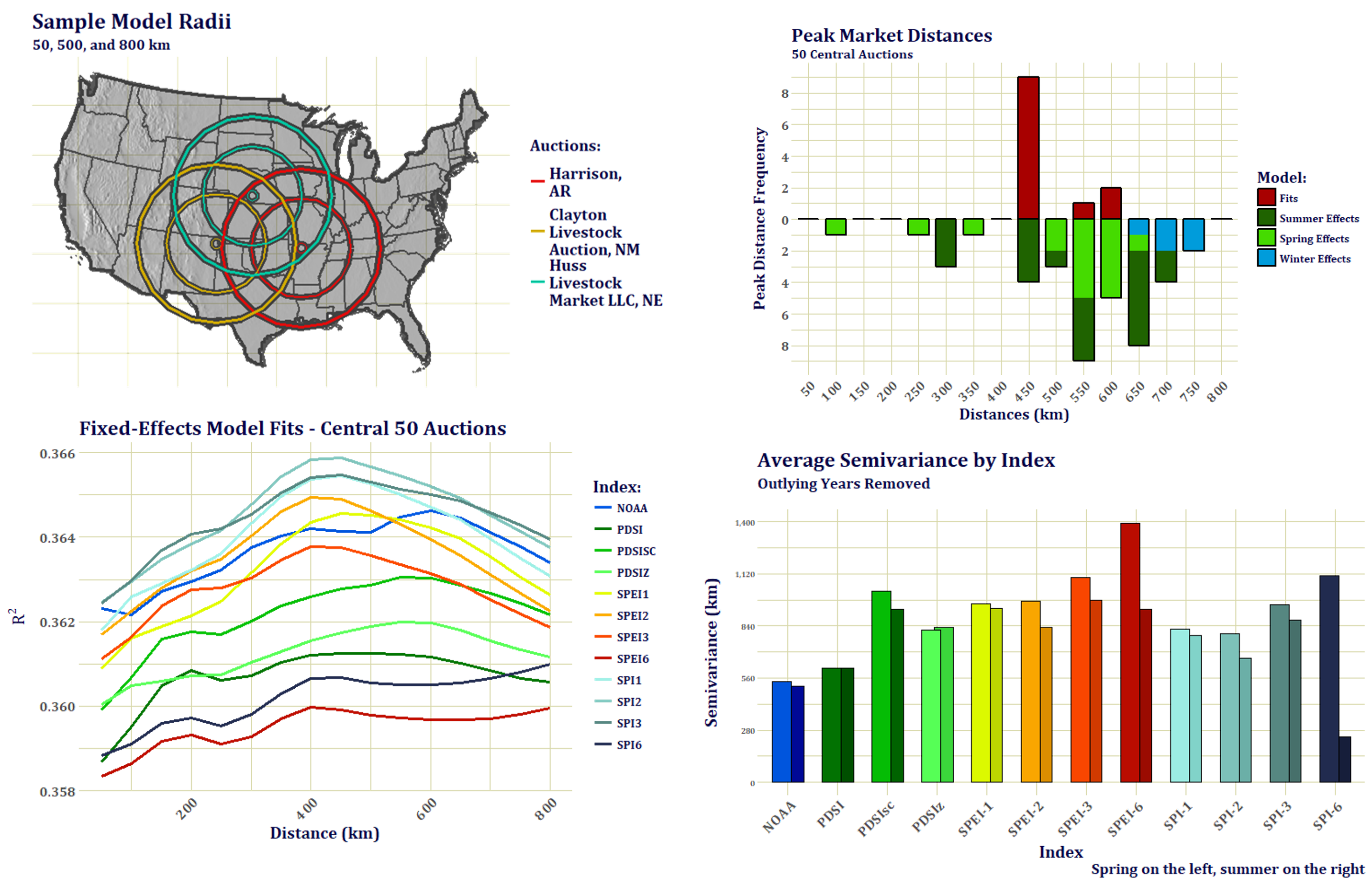
I didn't know how large of an area of ranching activity an auction represented, so it was suggested by one of the professors to run regressions at larger and larger radii until model fits and coefficients peaked. Indeed, peaks emerged. The areas were much larger than I'd expected, and the difference in model fits were small, but very distinct. Only 50 of the most central auctions could be used because the market areas crossed the US boundaries in the north and south. Above shows a sample of the auction radii, a graph of both model fit and effect peaks, and a run of spring and summer semivariance ranges for each index to check that the resulting radius distances weren't a mere effect of the index itself. Peak coefficients were only chosen if they consistently rose and fell. They peaked at different distances for different times of the year. Research into cattle transportation networks also corroborated this scale and seasonality, with market communities discovered ranging from about 400 to 650 km. 500 km was chosen as a compromise and a generally defendable distance.
Class - Earth Analytics
Earth Analytics is a relatively new class that is hosted by Earth Lab at CU. It aims to train future data scientists in the use and communication of large earth-based data sets. This class was run in R, but it will be run in Python from now on. We had a lot of remote sensing lessons, learning both the physical process of imagery collection and multispectral image analysis.
Calculating Deforestation following the Political Coup in Brazil
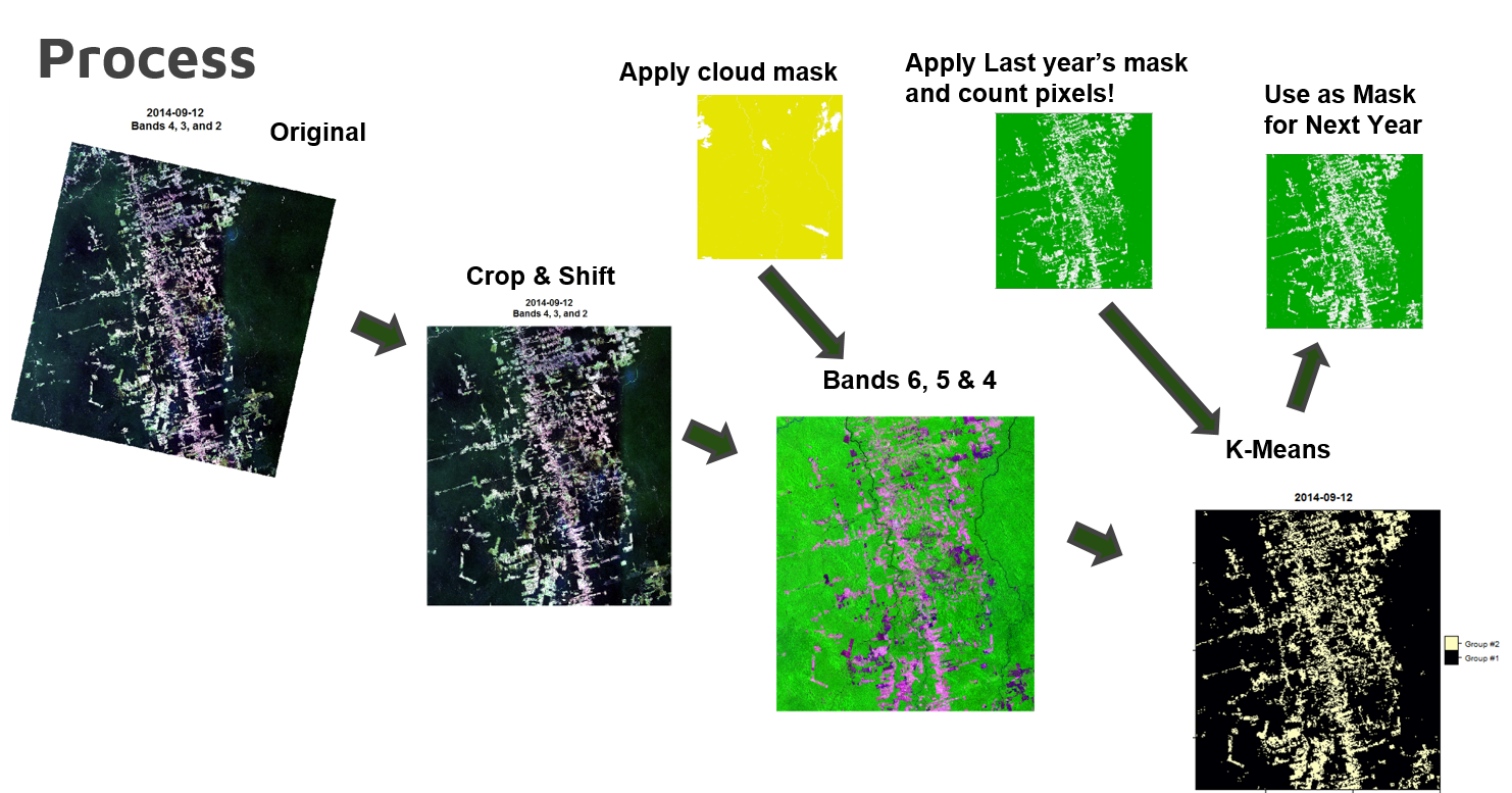
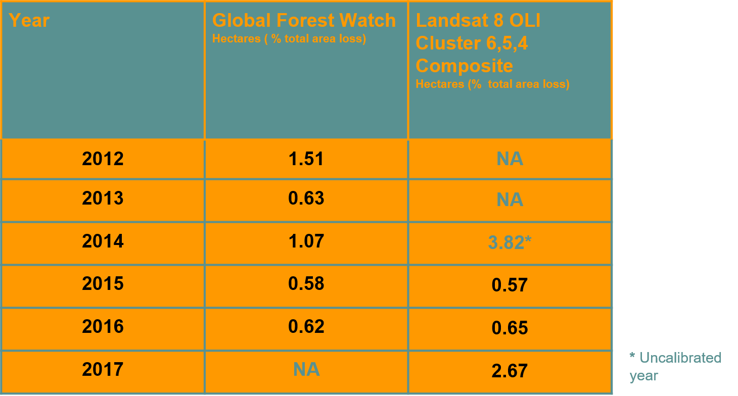
This was a group project based on an idea from a class-mate in the Environmental Biology Department. She wanted to see if there was a detectable change in deforestation rates after Michel Temer took the Brazilian presidency in 2016. Temer was known to be highly supportive of the agribusiness industry of Brazil, and so we expected to see a large spike in rates. I was responsible for figuring out the statistical analysis on the satelitte side while the teammates did background research and calculated our validation statistics from an open-source forest monitoring service call Global Forest Watch (GFW). I took yearly Landsat 8 OLI images since 2014 at the same time of year with as little cloud cover as possible from a place we deemed representative of the problem. Then I made a composite cloud mask and applied it to each image to filter out places with inconsistent data. I had to line all of the images up exactly, there is some shifting between years, so some of the images had to be cropped for consistency. Then I extracted bands 6,5, and 4 because they appeared to be the most contrasting combination. Following that, in sequence, I ran a k-means clustering algorithm on each image using a deforested area mask from the prior year. This needed to be done because crop and grazing land fill in the deforested areas in the subsequent year and this throws the cateogrization scheme off. Also, this was seen as suitable for the time frame we were working in because trees don't grow back quite that fast. After that I calculated loss rates and we compared the results to figures from Global Forest Watch (GFW). The first year was way off because it was uncalibrated, but the next two years almost exactly matched GFW. Our model showed an incredible spike in deforestation for 2017 before the GFW numbers came out, much higher than we expected. Neww stories about the problem, though, note a severe spike, so once I take the time to calculate the new GFW rates I'll post it up here and we can see how well this strategy worked during the third year.